PLEASED
I’m a Digital Product and Dataviz Designer,
who loves surfing and whisky.
Started out as a graphic designer, in the last few years I developed my skills in UI and UX design.
I have been creating brands, print media and interactive experiences for over 10 years.
And now I want to specialize more. That’s why I’m looking for a UX position that values my visual way of thinking and doesn’t mind me asking frank questions. A big plus would be if I can enrich projects with data visualisation.
(The portfolio is currently getting a fresh coat of awesome!)
– Data Visualization, UX/UI Design
800 Routes of Diversity and Contrast
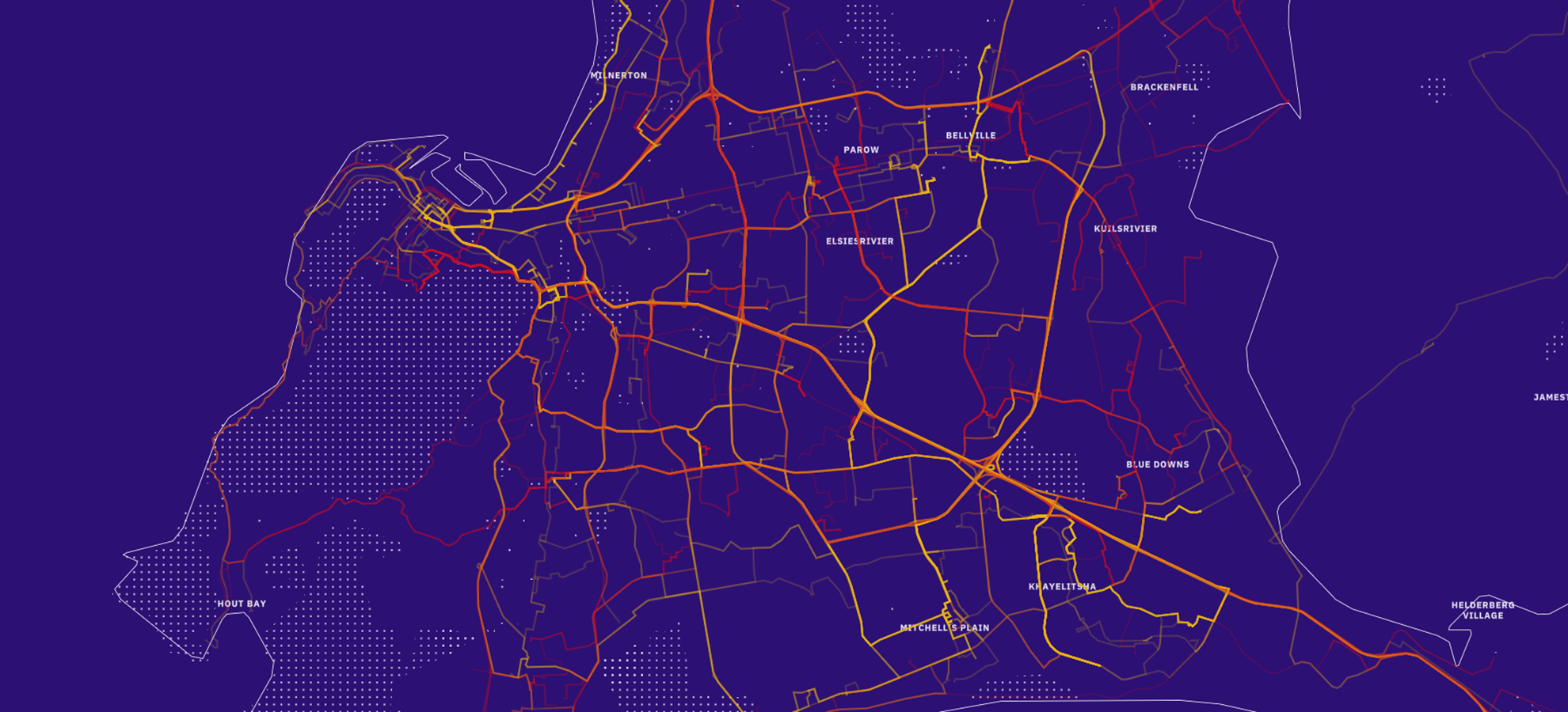
»City in Flux« visualizes the informal and formal mobility networks in Cape Town. It reveals hidden patterns and dividing lines throughout the city and tells meaningful stories that help to understand the developments in the city’s physical and social mobility networks.
– Data Visualization, UX/UI Design
Hitting the Core –
An Explorative Design Approach for the Analysis of Categorical Data
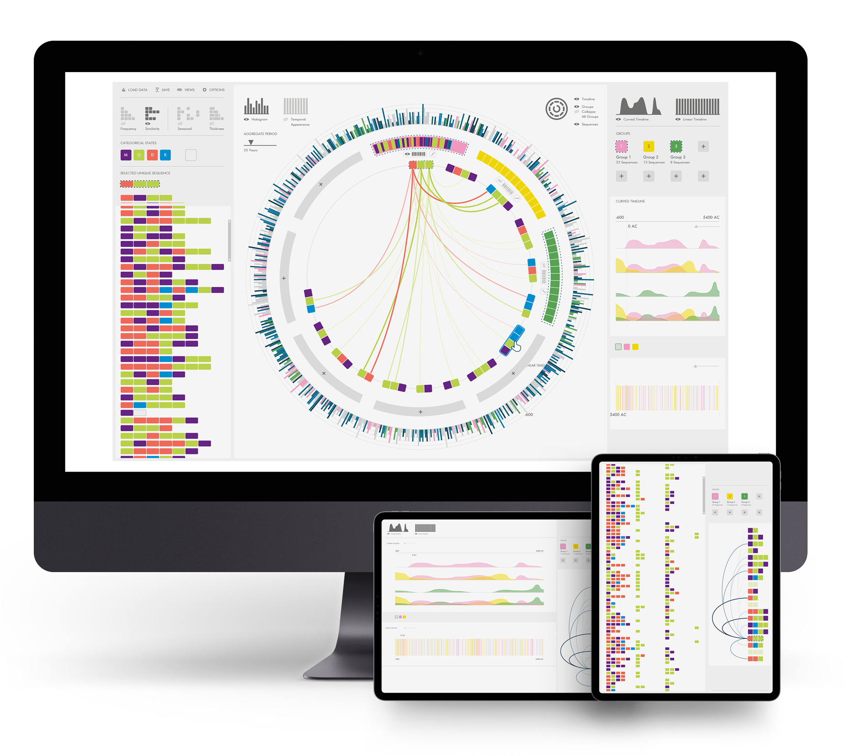
Comparing categorical sequences over a long period of time helps researchers validate or generate hypotheses and identify further research questions.
In my master’s thesis, I explored the possibilities of visualizing such data and developed and evaluated a visualization tool suitable for this purpose for domain experts.
Personally I am a big data visualization enthusiast and see the big potential to make data more accessible and usable.
Making Data Visible and Understandable
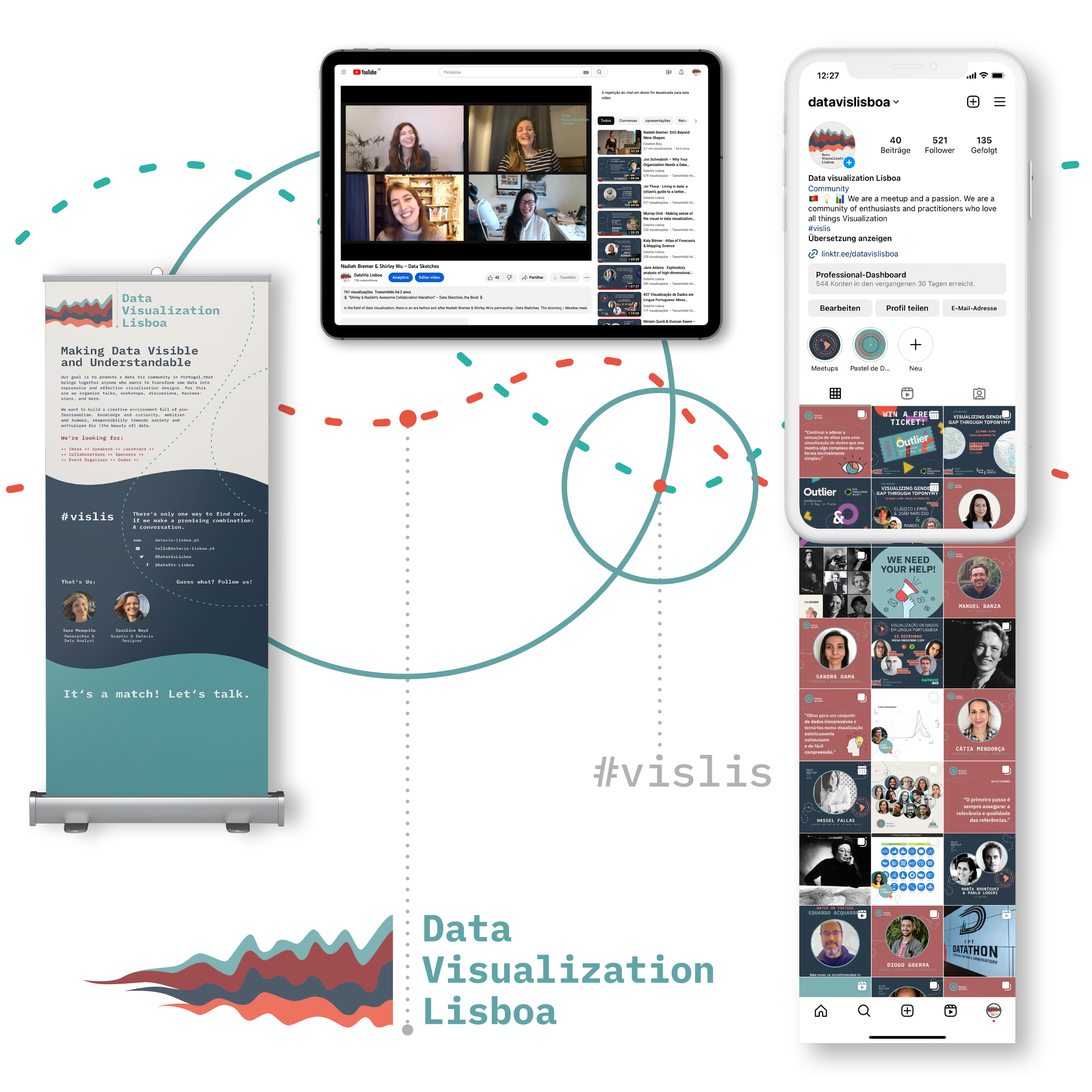
Data visualization is an emerging field in Portugal, with increasing investment from companies and universities. “Data Visualization Lisboa”, founded by my friend Sara Mesquita and me, has played an influential role in building a community interested in promoting data visualization as a tool for communicating insights. Through talks, workshops, and hack sessions, we aim to enhance individual skills and transform raw data into expressive designs.
I was responsible for designing the visual identity. To create a memorable brand, I focused on using a harmonious color palette and a stream graph as a figurative symbol, which represents development and variety. Additionally, I chose a fresh and readable typeface that is easy to use in the visualization field, resulting in a versatile visual identity.
I used my basic web development skills to create the website in a half-day workshop. Even though I am not a programmer, my knowledge in this field is an advantage when providing a smooth user experience and communicating effectively with developers when creating digital products.
Have a look at our Website: datavizlisboa.pt


