Hitting the Core
– An Explorative Design Approach for the Analysis of Categorical Data
Comparing categorical sequences over a long period of time helps researchers validate or generate hypotheses and identify further research questions.
In my master’s thesis, I explored the possibilities of visualizing such data and developed and evaluated a visualization tool suitable for this purpose for domain experts.
2019
One SemesterMy Role
UX/UI Design, Data Visualization, Editorial Design, Scientific ResearchContext
Master Thesis at FH Potsdam, in collaboration with the Geo Forschungs Zentrum Potsdam

Challenge
The task at hand involves analyzing and comparing large amounts of categorical sequences over a long period of time to identify semantic and temporal similarities. Existing visualization techniques cannot handle this amount of data while remaining simple to interpret. The GeoForschnungsZentrum (GFZ) made a first approach to address this issue by developing a fitting analysis tool called “Tiefer See” (Deep Lake).
The aim is to evaluate possible visualization approaches to represent and analyze similarities of categorical sequences within a high temporal volatility. The proposed interface model helps explore semantics and temporal context to assess the similarity of categorical sequences and support the development of visual analysis methods for scientific research.
Designers can help users identify relevant patterns in long time series by designing both the visual representation of the data and the graphical user interface so that attention is fully focused on the data and its associated tasks.


Design Process
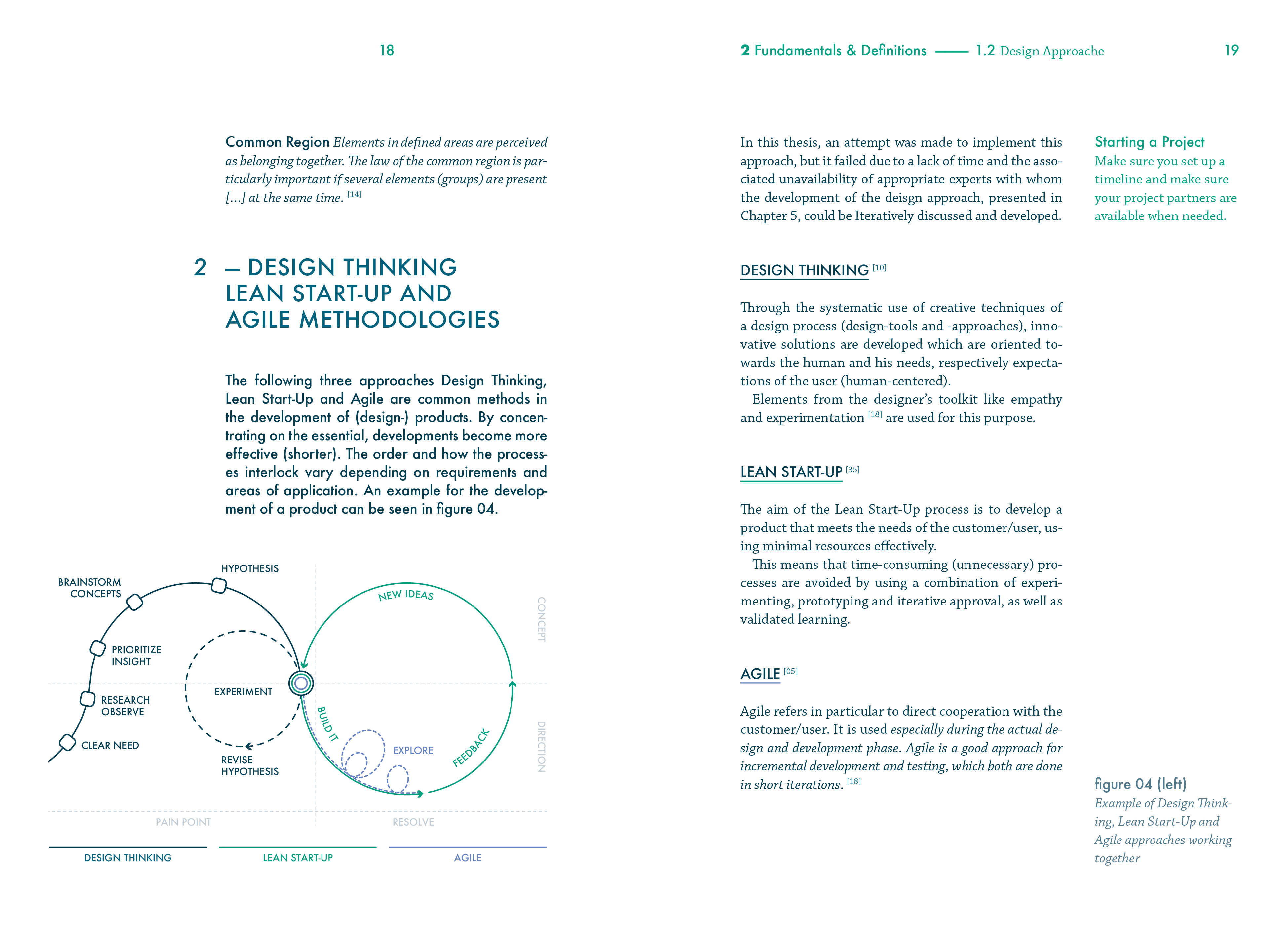
The design process involved developing analysis questions and exploring various visualization approaches, including using design basics and existing research.
The project was structured using a project diary to track inputs, outputs, processes, results, challenges, and conclusions.
The analytical Challenges
The first step involves identifying the analytical challenges of the dataset and formulating the analysis questions to be answered through visualization:
How can unique categorical sequences be visualized in an effective way (single and in relation to the overall picture)?
How to provide a reasonable overview of all given relationships (similarities: time and semantics)?
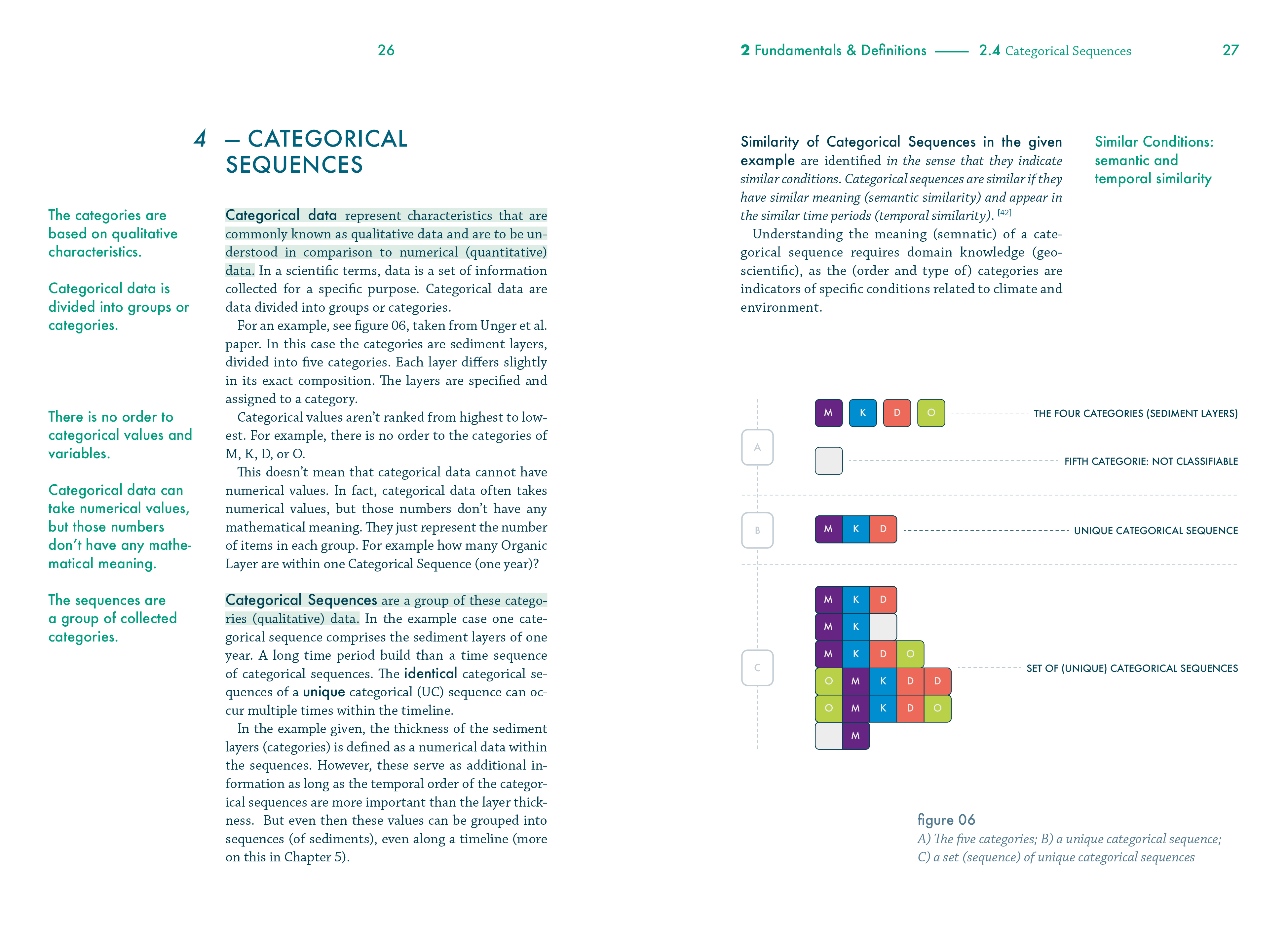
A dataset comprising many unique categorical sequences within a high temporal volatility and many thousands of sequences (years). Visualizations are needed that refer to the similarity of the data and target the unique sequences and groups of them, while providing an overview of the entire data set.
It needs a thorough understanding of the problem through consultations with stakeholders, literature research, and method compilation.
In the Explorative Design stage, ideas and visualization approaches are explored with the help of design knowledge from interface and visualization design. The considerations include design basics, research results, and further definitions and reflections on color and interaction. RawGraph is used to gain a first impression of the dataset, pen and paper for sketching ideas and concepts, and Adobe Illustrator to create more accurate drafts. The analysis tool provided by GFZ and the associated exemplary dataset serves as an example basis to create a result that reflects realistic requirements.
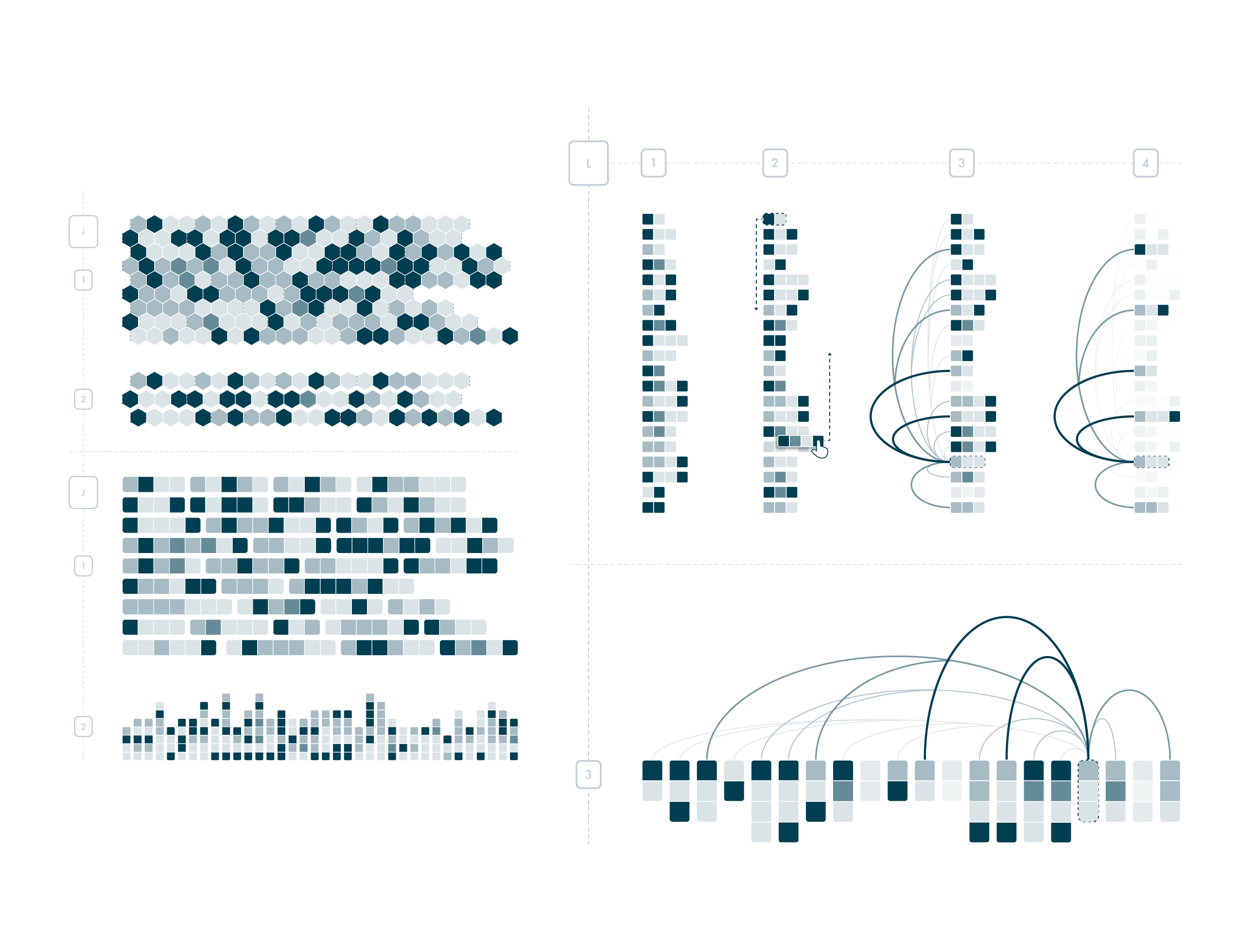
The Analytical Procedure
1. Identify unique categorical sequences, by inspecting the semantic and temporal overview.
2. Construct a group that comprises similar unique sequences.
3. Inspect groups of related sequences to verify hypothesis or gain further research questions.

The Project Diary helps to follow-up and link the different steps. Each step is discussed directly on its functionality so that in the end, the most suitable representation for the temporal and semantic, as well as comparative representation, becomes clear. The diary includes the input, output, process, results, challenges, and conclusion of each step. The requirements for visual representation and related tasks become more complex with each step. Through this process, the most suitable visualization solution is developed to answer the analysis questions and meet the challenges of the dataset.

Visual Design
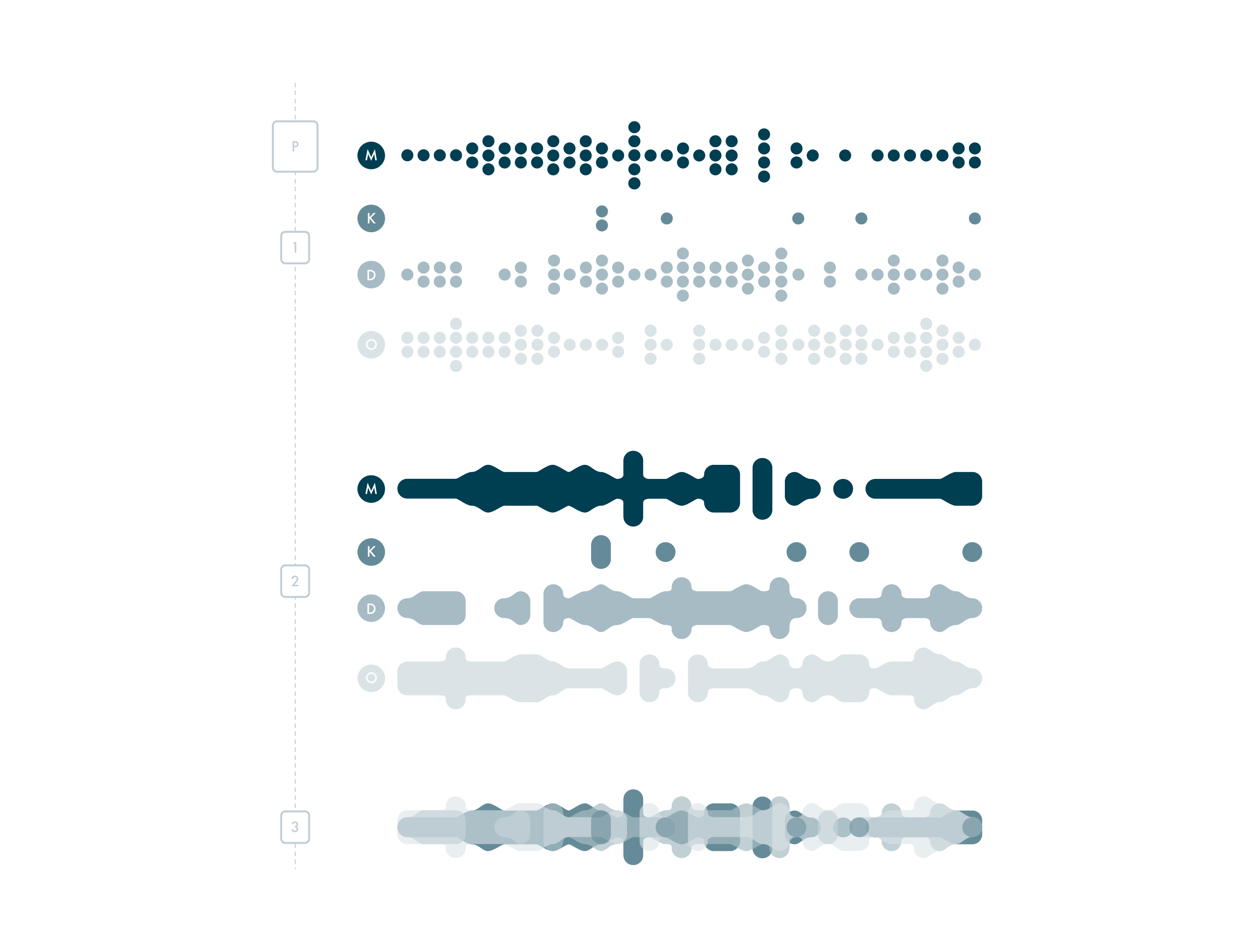
The analysis tool takes into account the importance of appropriate color selection and well-implemented interaction mechanisms.
The color scheme is chosen based on the user task, with a limited selection of ten colors that are scalable according to a sequential multi-hue scheme.
The interaction mechanisms include animated UIs, which provide a continuous interface for the user, and multiple views that allow the user to move smoothly across scales, data types, and research questions. The interaction techniques are based on a list of design requirements, including direct manipulation, overview first, zoom and filter, dynamic multi-foci, temporal hierarchies, grouping and aggregating for data abstraction, history, and annotating. All of these factors contribute to a smooth and user-friendly analysis of the data.
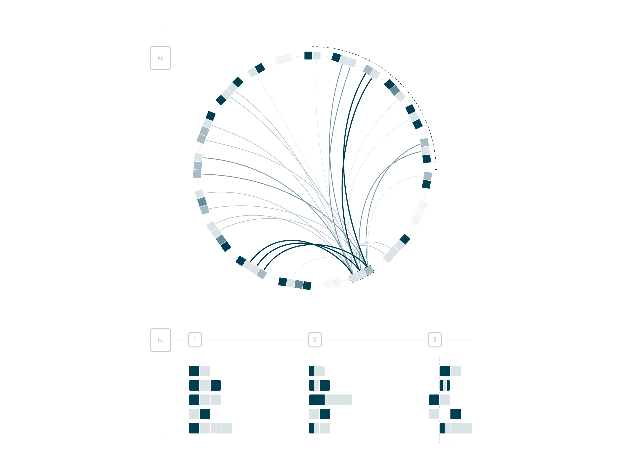
Visual Framework
The framework is designed to have a simple visual appearance and interaction techniques that do not distract from the task at hand.
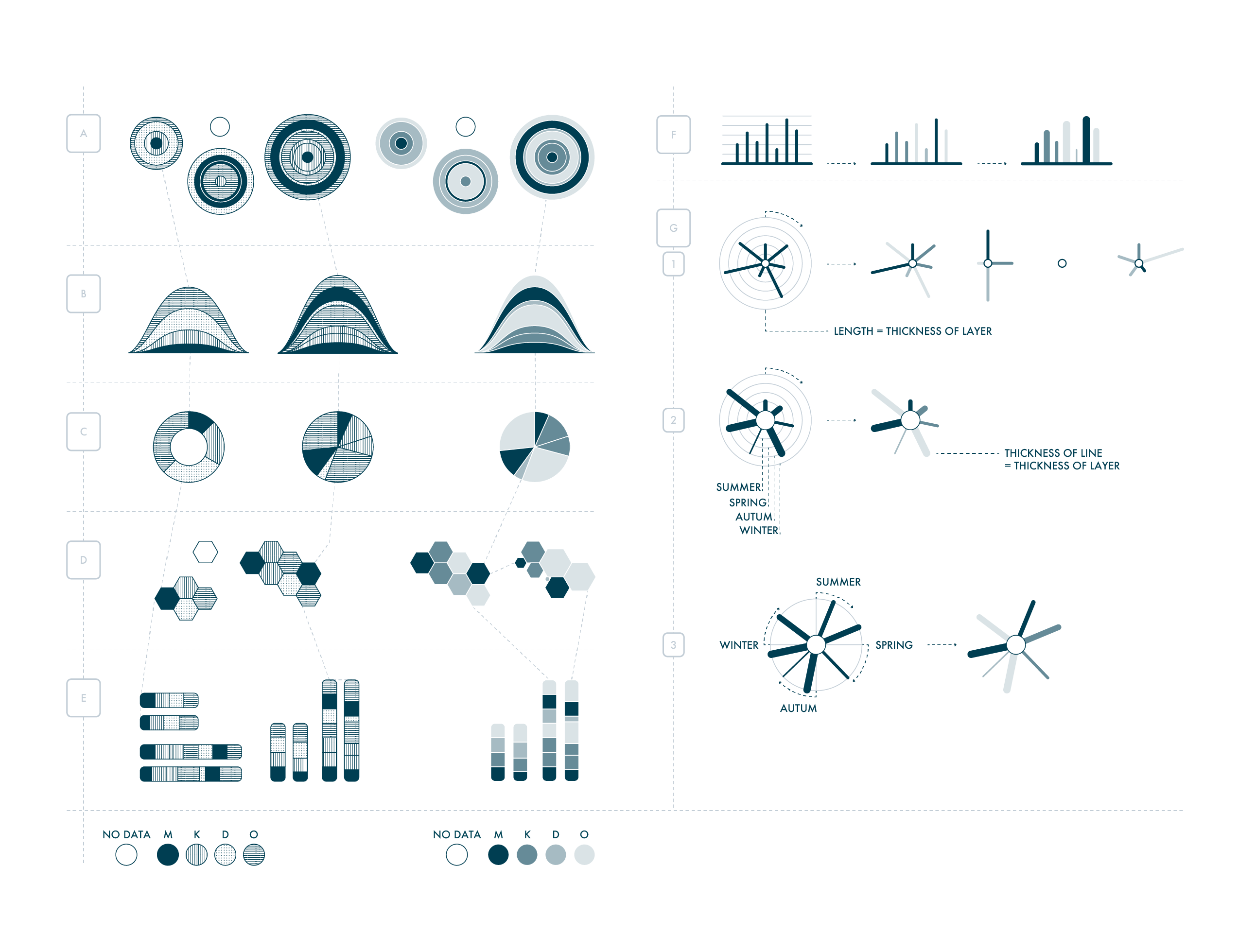
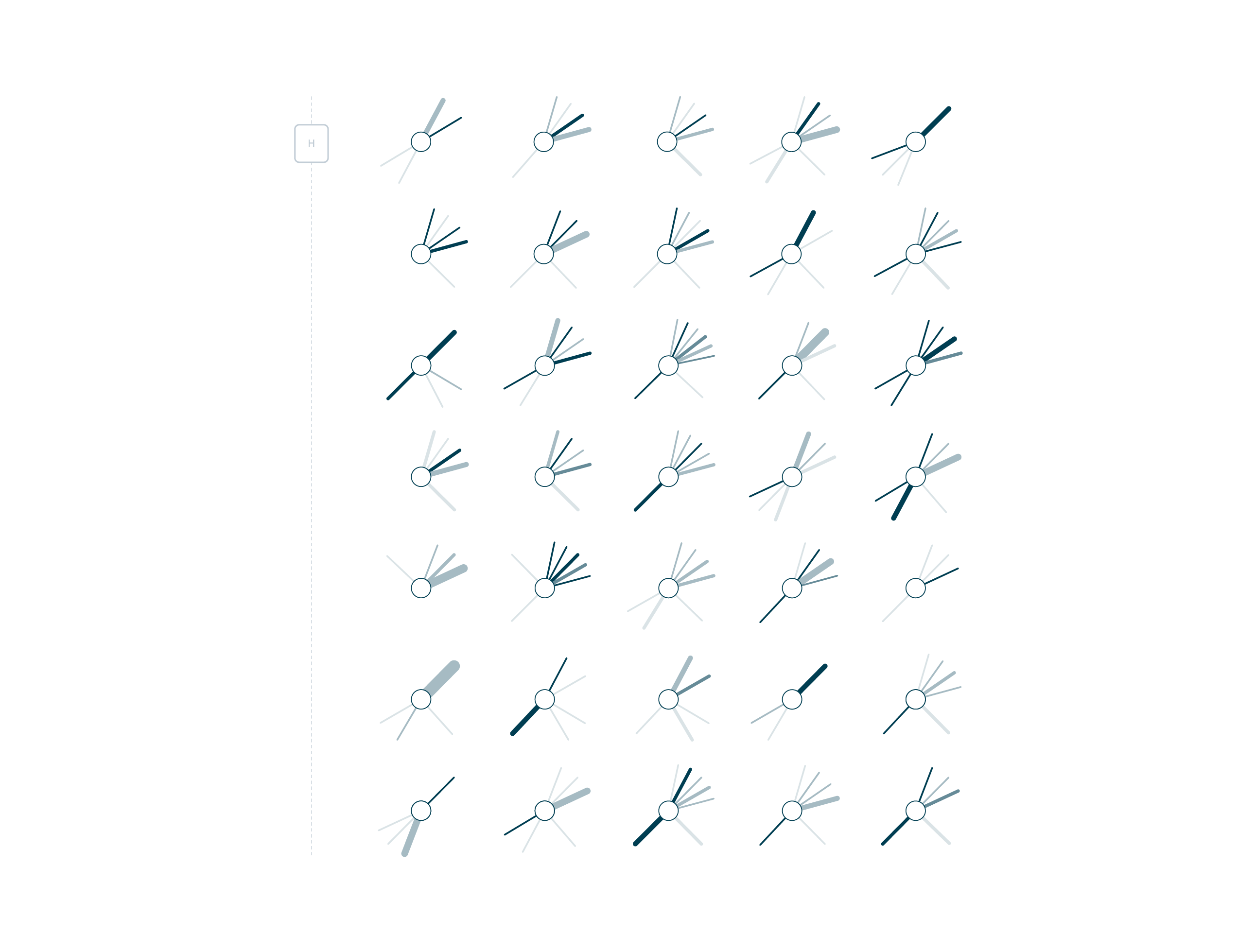
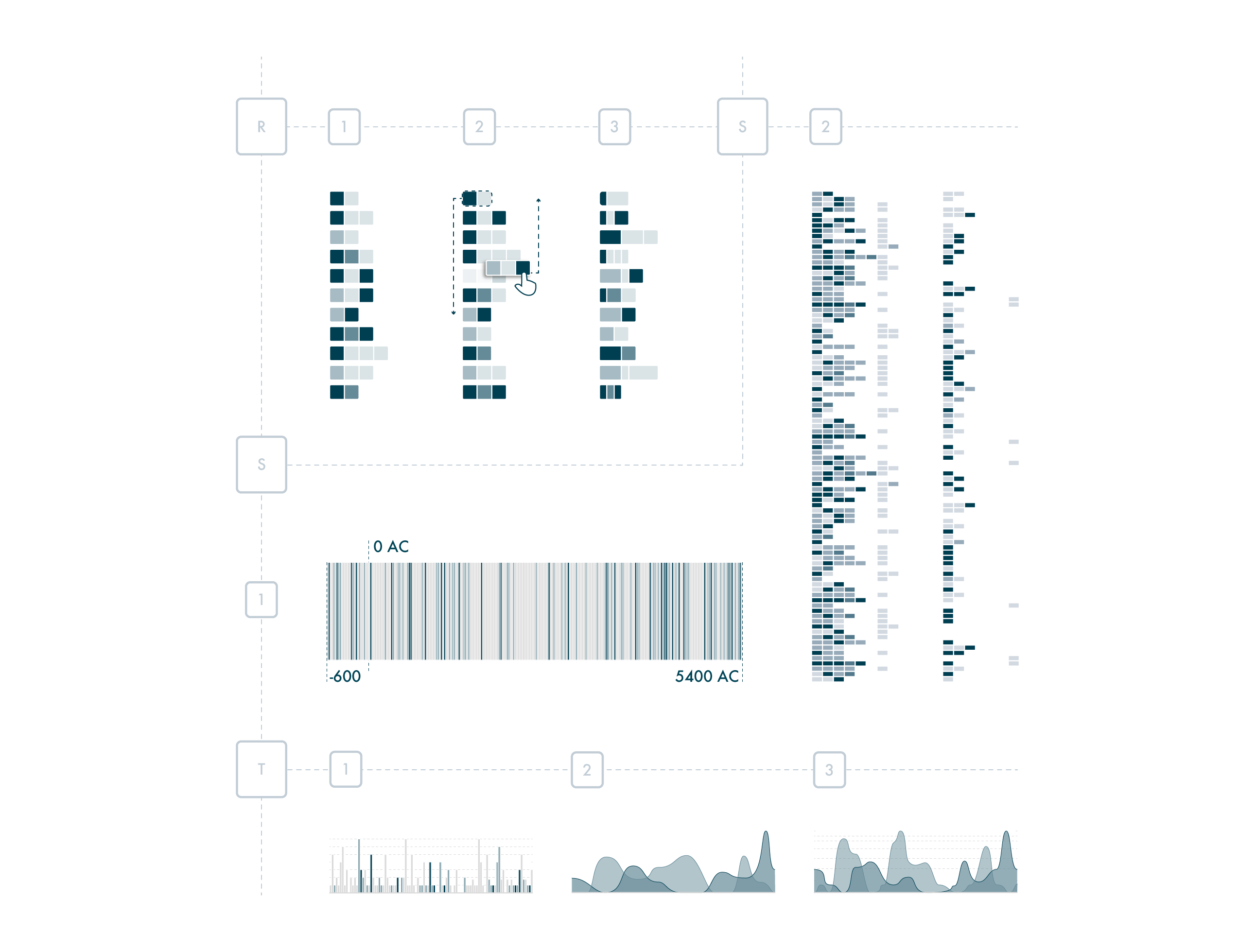
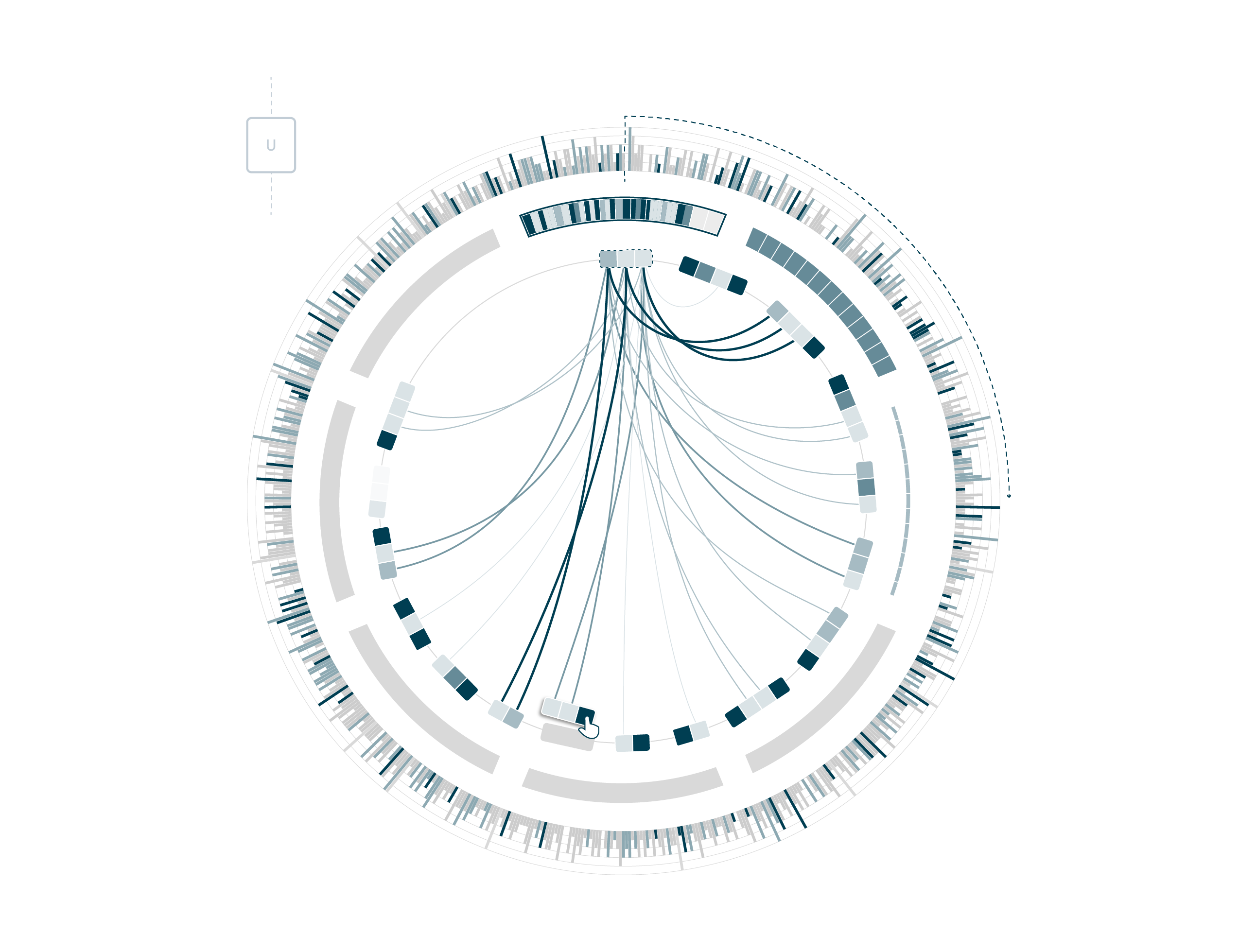
The design of the tool is based on a taxonomy of the design space, which is used to review different layouts for representing time-series and categorical data. The proposed interface combines different diagram types for each level of detail and scale, such as a linear or circular layout for the temporal overview and stacked or interleaved plots for the categorical data. The main view consists of a stacked circular representation with a contiguous interleaved timeline and a discrete interleaved circular order for the unique categorical sequences and groups.
The additional view for the groups contains a stacked or interleaved line plot, and the stacked overview for the UC sequences can represent different types of ordered lists, such as quantitative, ordered by similarity, thickness, and season, which can also be represented as a timeline.

Overall, the final tool provides a comprehensive visual framework that allows for the identification and inspection of groups of similar unique categorical sequences with high temporal volatility.
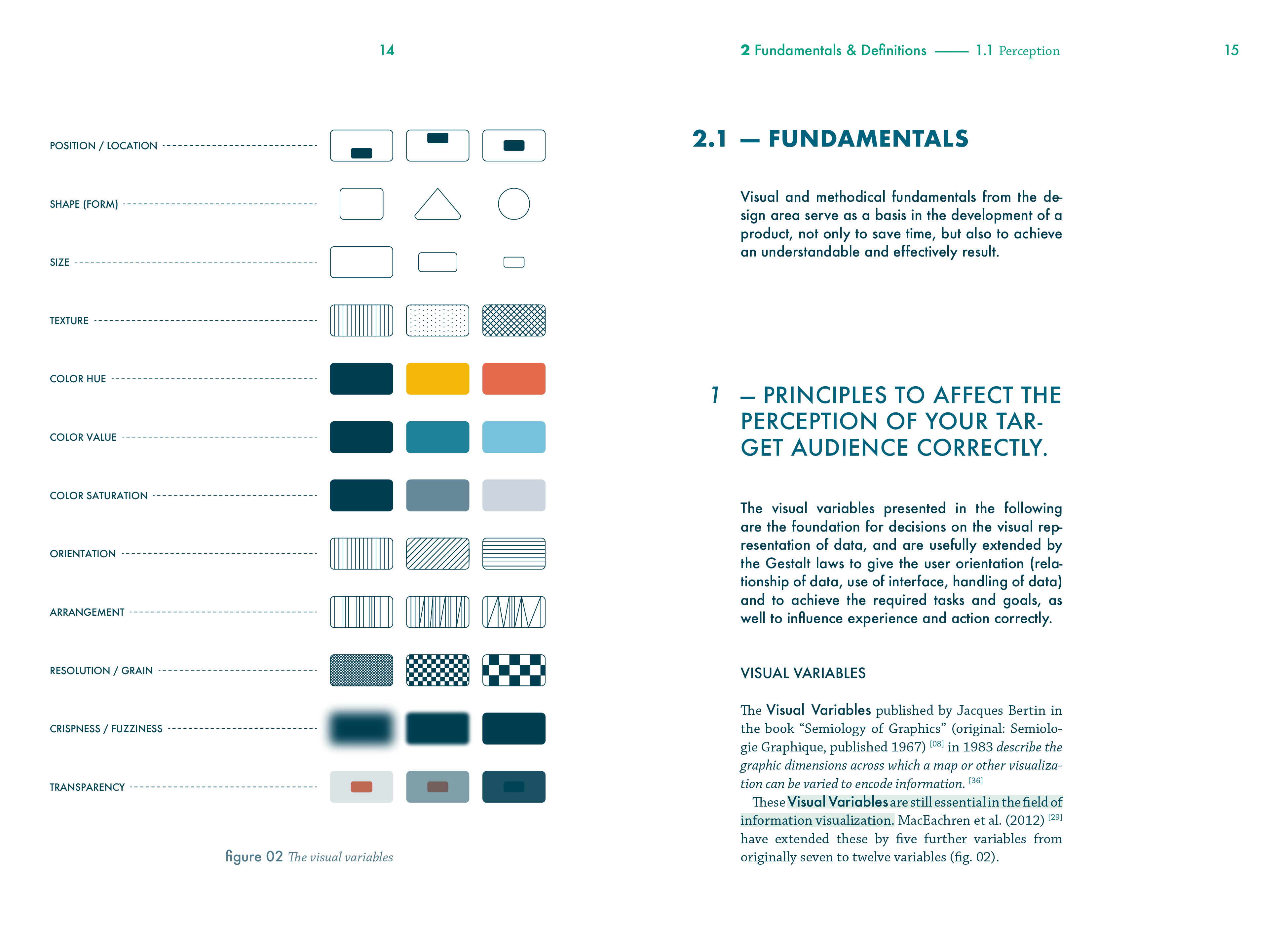
How the Tool works
A brief overview of how the tool is constructed.
Result
Representing categorical sequences over a long period of time is still a challenge in many fields, including geosciences. The approach presented in this thesis supports the investigation, identification, grouping, and evaluation of similar categorical sequences in semantics and time.
The graphical model developed for this purpose brings together visual and interactive approaches, allowing investigation from various perspectives. Further studies and user testing with different datasets are needed to refine and verify the approach.
Despite the lack of diverse experts help, I was able to gain valuable insights into the field of data visualization through research, conversations with designers and data scientists, and practical experience. The thesis highlights the importance of visual exploration in combination with user experience design in data visualization and shows that exploring complex topics does not always follow a linear path, but can lead to innovative approaches and methods.